Flowcharts Are Cool
A picture can be worth a lot more than a thousand words.

A classic from XKCD/Randall Munroe and a sop to my teenaged self:

In my last post, A Step in the Right Direction, I mentioned that the CDC quarantine and isolation guidance is great in terms of content but heavily reliant on the reader both paying close attention to the content and reading the whole page. I know that, on my first pass, I thought the guidance was awful, mainly because I missed the nuance (it was all text and nuance didn’t stand out), thinking they hadn’t segregated guidance for vaccinated/recently infected people from those that didn’t fit this description. When I read the whole page, however - on my laptop and not on my phone - it was a lot better. But this info is important enough to convey correctly upon first glance! All sorts of agencies, companies, and facilities rely on it to inform their own policies for staff reporting to work, kids being allowed at daycare or school, or how many people to allow into a given building at any point in time. This needs to be super clear and obvious.
Flowcharts - They’re Like the New Black
I had a commenter on that post suggest that they use a flowchart or decision tree instead of a mess of words and, honestly, I don’t know why I didn’t do that in the post (it’s sort of my raison d'être). So, I took them up on the suggestion and made one for the CDC guidance!
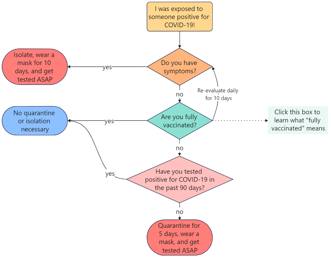
This is far simpler, requires much less text, and if you use color, even catches the attention of the reader. It even takes a lot less time to create and can be more mobile-friendly than text. I mean, I created it using EdrawMax Online, which is a free tool.
Just Draw a Picture
I have two cats - Archie and Carbon:

(Yes, I just became that guy that put his cats in a newsletter and, no, I don’t like the Seahawks. My mother-in-law made this blanket for us a few years ago and put the ‘Hawks on one side and the Portland Timbers on the other. It’s a nice blanket but I’m a Vikings fan…but onward Rose City #PTFC.)
Anyway, I bring this up because while these cats are pretty much awesome, they’re still…cats, and cats are gonna cat. One of my most-favorite Venn Diagrams is about cats, mainly because it’s brutally accurate:
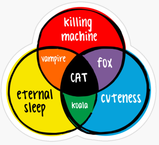
I don’t have to know all about cats or read endless books about them to get the idea here. See the picture, get the idea. Done.
Assume Your Audience is Full of Distracted People
The vast majority of people that care about this CDC policy guidance right now will be:
Workers that must report to a building
Parents of preschool or school-aged children
The people that run the buildings or schools that serve the workers and children
Most of these people - and, honestly, society writ large - are busy, distracted, frazzled, dealing with less than a full staff, or some combination of these. So, instead of trying to fight it, just own it. These are your people. Serve them.
Even Government Agencies Do This Kind of Stuff
Now, you might say, “Well, yeah, Jeff…but the CDC is part of the federal government. They’re not that creative.” You may be right, I may be crazy, but there may be some lunatics that can create these, even within the federal government.
For those of you that know me or follow me on Twitter, you may know that I’m a certified pilot and flight instructor. I taught students to fly full-time at Embry-Riddle Aeronautical University-Daytona Beach for 4 1/2 years about 15 years ago and was in management in their flight department for 8 years after that. As you may or may not know, there are a lot of regulations in aviation. I’d guess this is due to the inherently-risky nature of being in a vehicle that’s subject to gravity flying thousands of feet above the ground with no ability to pull over should something go awry. I mean, think about it. If you run out of gas on I-5 near Seattle, you pull over and call AAA or walk to the next exit. If you’re adventurous, maybe you thumb it and hope for the best. If you run out of gas in a Cessna 182 at 8,000’ over Seattle, however, you’ve got a one-way ticket back to Earth, which will involve an involuntary landing…somewhere. You’ll probably survive…but the airplane may not, and you have a headache (and large expense) on your hands to get it back home even if it does. So, there are a lot more rules about flying with enough gas than there are about driving with the same. The stakes are just higher. For everyone involved.
Due to this context, I spent many, many years learning and teaching from “The Good Book” - the Federal Aviation Regulations-Airman Information Manual, better known as the FAR-AIM, which is the rulebook (the “FAR”) and best-practices guide (the “AIM”) for pilots of all stripes (pun intended). It’s from this book that I realized that pictures are definitely worth many thousands of words…mostly because there are lots of words in the FAR but lots of pictures in the AIM.
Since there are so many rules, the Federal Aviation Administration (FAA) often uses flowcharts and matrices to convey what’s needed to prevent information overload. As mentioned above, the stakes are just higher thousands of feet above the ground. Thus, taking off in an airplane with a broken airspeed indicator (roughly the airplane equivalent of a speedometer) isn’t the same as driving your car to city hall with a busted tachometer. Certain pieces of equipment must work for you to even fly the plane and, even if it isn’t required, you have to label it as inoperative and then fix it the next time your plane heads to the hangar for a tune-up. Them’s the rules.
Here’s an example. In this Advisory Circular (AC 91-67) - a document that helps explain how they interpret and enforce some of the FARs - they drew up a rudimentary flowchart that helps a pilot-in-command determine if his/her airplane is allowed to fly if certain equipment is broken or otherwise out of service:
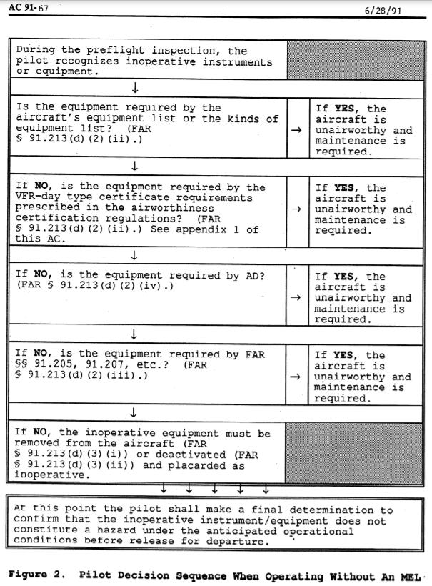
Now, they didn’t have EdrawMax or Microsoft Visio when it was written in 1991, so they had to do it this way (and probably on a typewriter), but it sure made this easy when I was teaching students to fly. Figure out your situation, follow the prompts until you get to your answer. Simple enough.
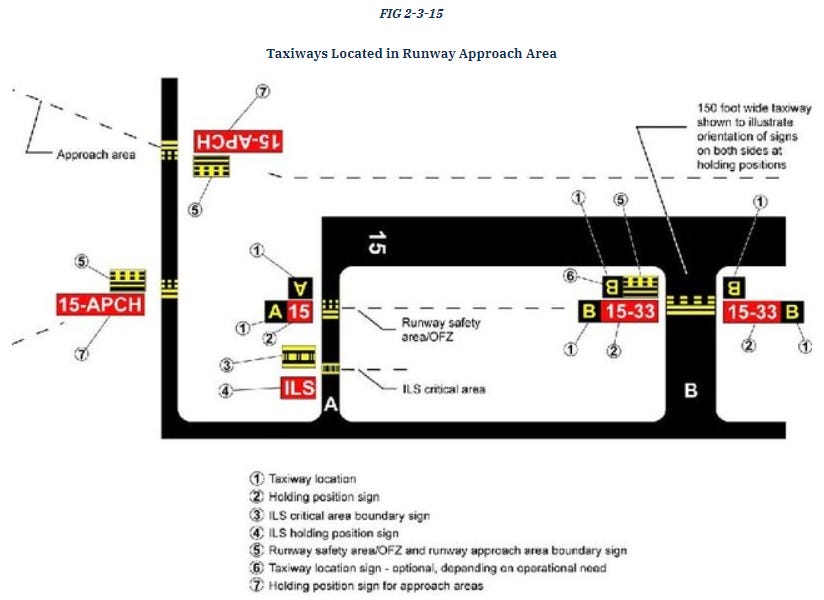
Wanna know what all those stripes and lights are at the airport? There’s a picture for that (and lots of other stuff) in Section 3 of the AIM:
Just draw a picture.
American Society is Nearing the End of a Collective, Prolonged Period of Trauma
If you’ve ever taken a psychology course, you’ve learned about Abraham Maslow’s Hierarchy of Needs:

The short interpretation is that if you’re busy meeting the needs near the bottom of the hierarchy, you’re nearly unable to meet any of the higher needs. If you’re hungry all the time, you don’t really care if you have friends. If you just lost your job (and the income that came with it), it’s hard to think too much about the PhD in Economics you really want to get someday.
Now, this is for individuals but you can pretty easily translate it to a group. The American populace has spent the better part of two years not just wondering if the ‘rona is gonna get them but also trying to find information about it so they can make honest risk assessments in their own lives, and they’re often running into disinformation. Society is operating closer to the bottom of the hierarchy than the top right now. Thus, you can’t expect everyone to be their best selves, paying close attention to wordy guidance.
So…Just Draw a Picture
Save the words. Use some color. Have fun with it. Use EdrawMax Online. I don’t care. But, in the end, get your point across with as little work and effort as possible. Put the rest of your information in a hyperlink in case people want to learn more.
Just draw a picture.